Women’s Healthcare Associates
UX/UI and Website Design

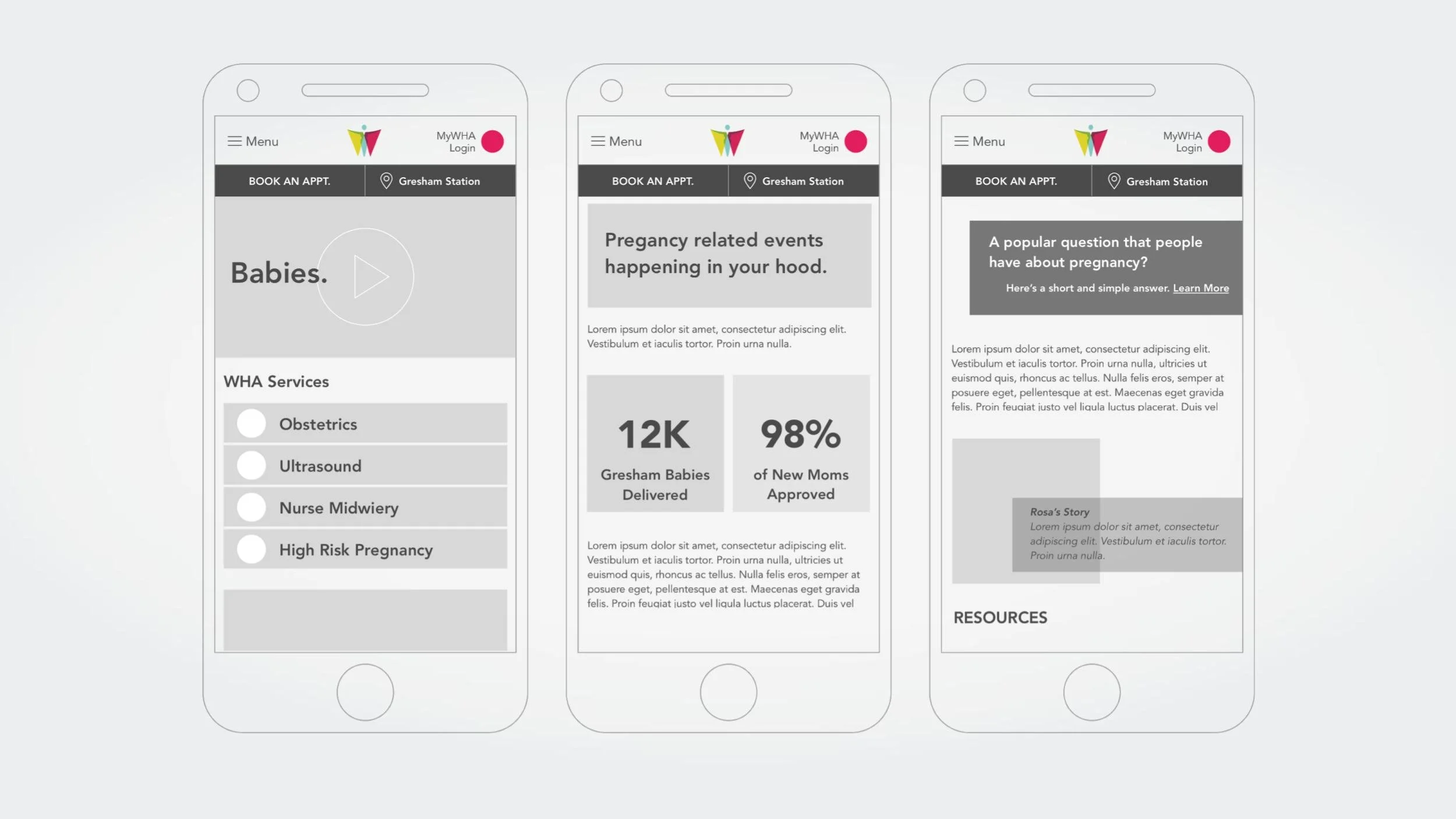
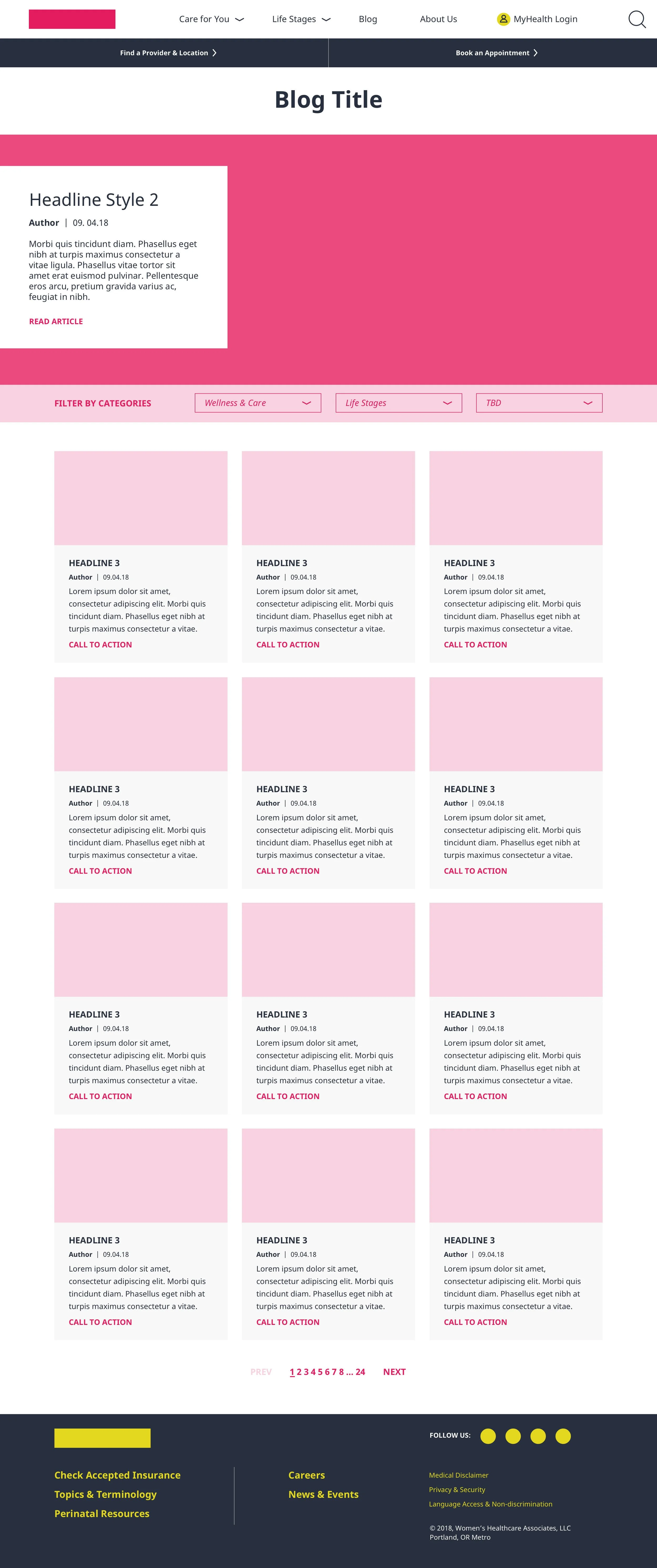
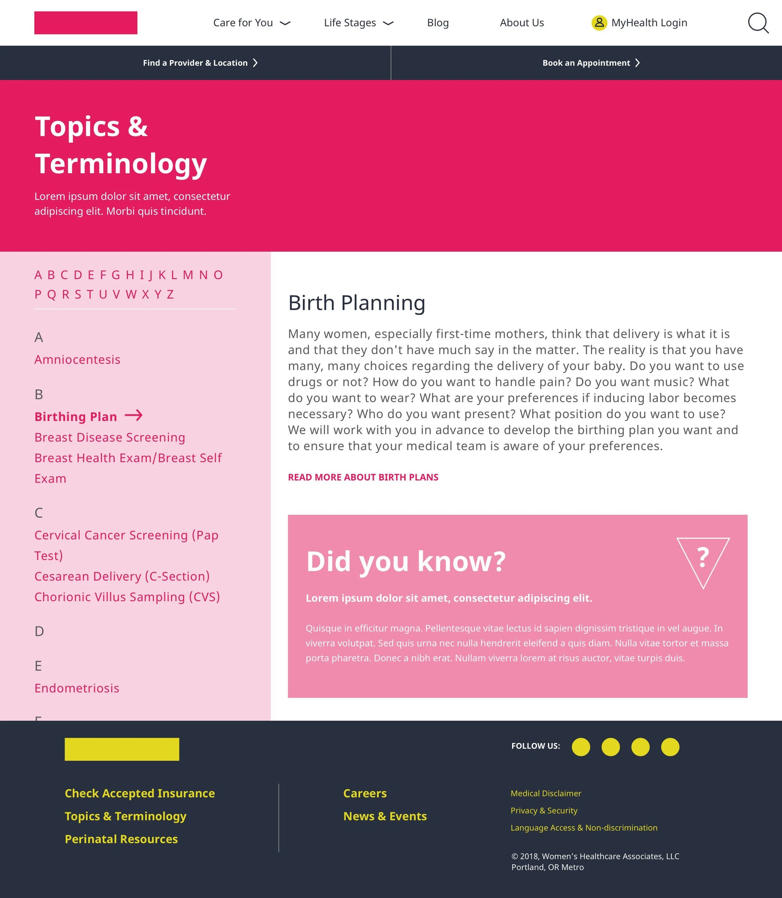
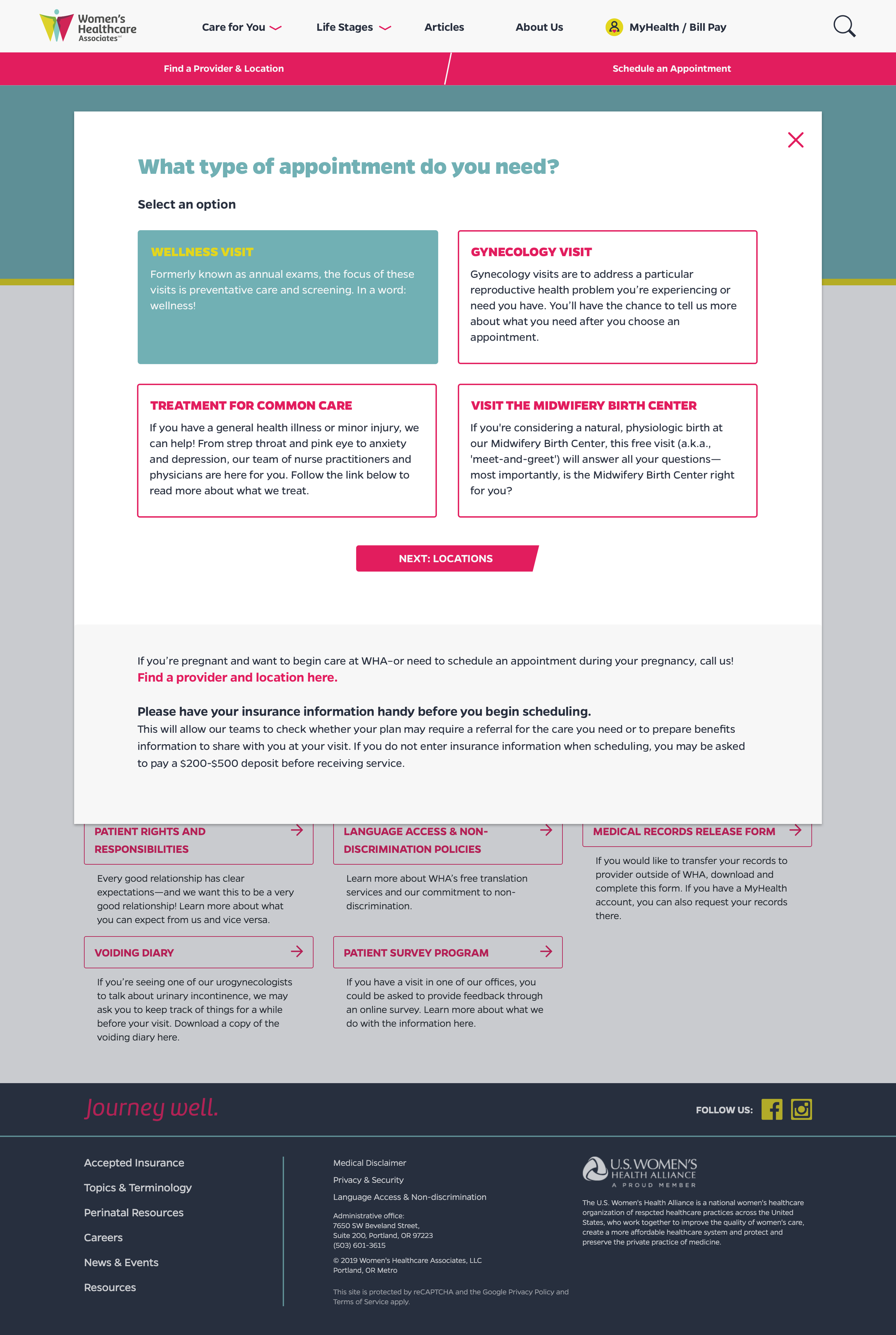
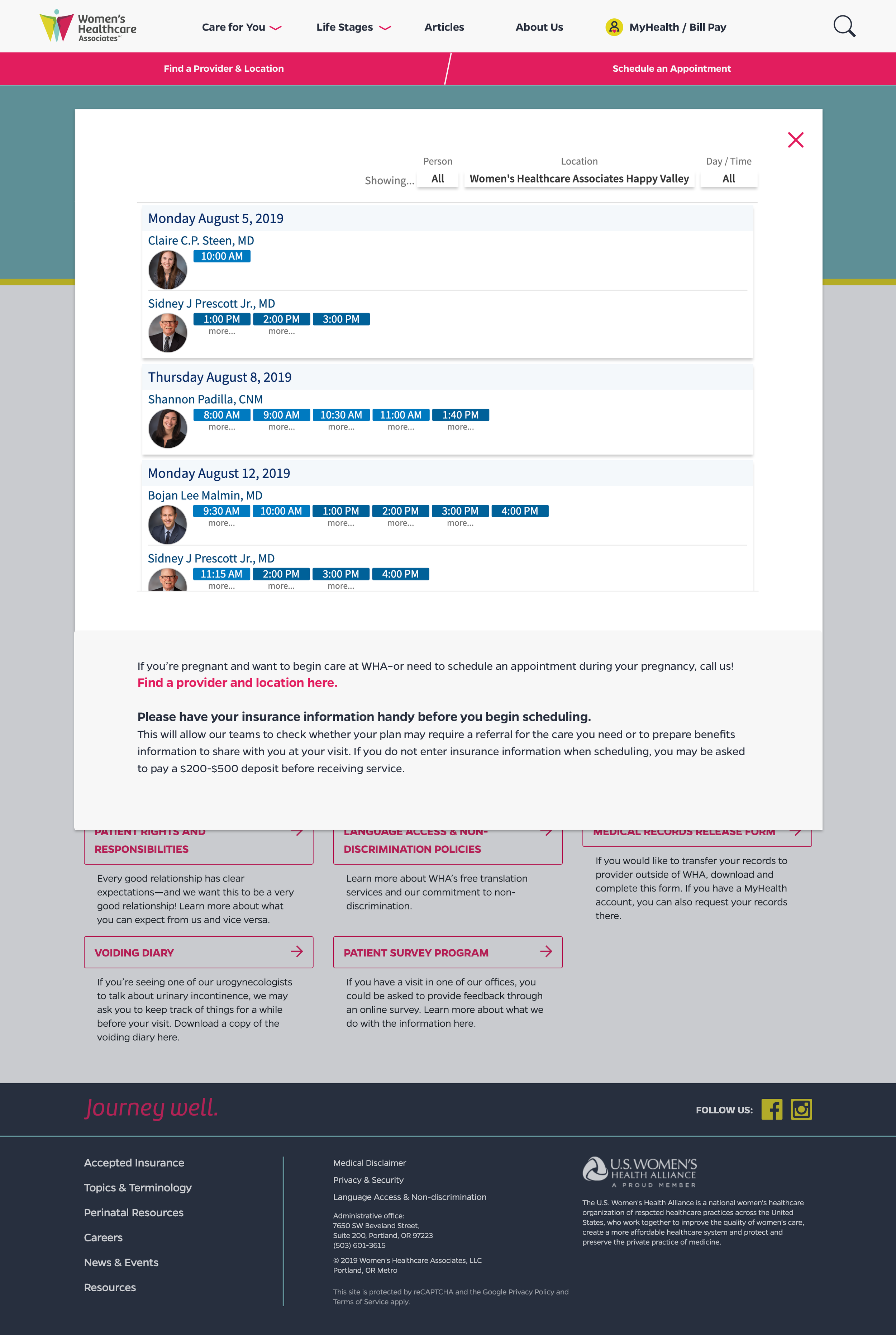
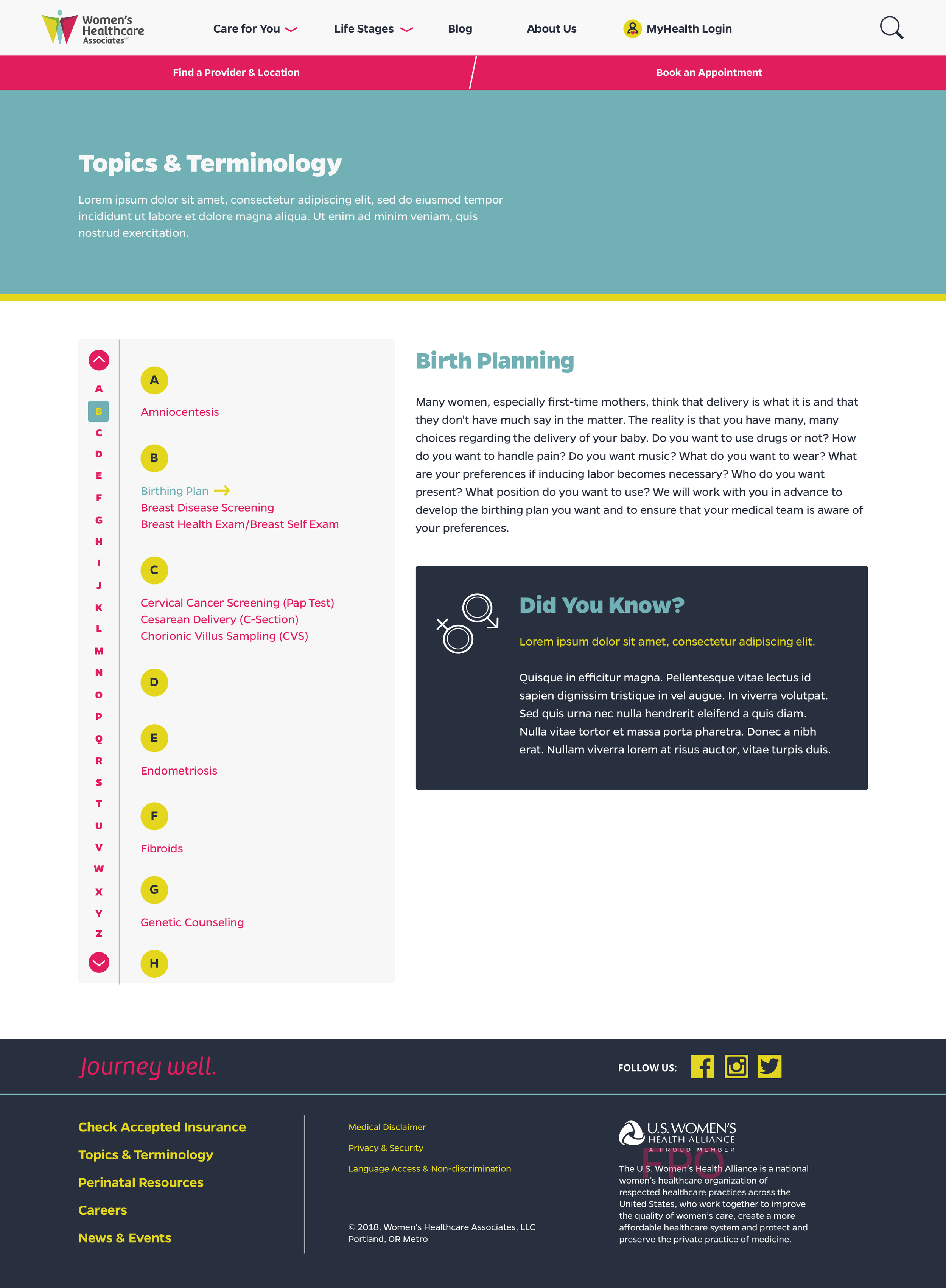
A healthcare website centered around your life stage.
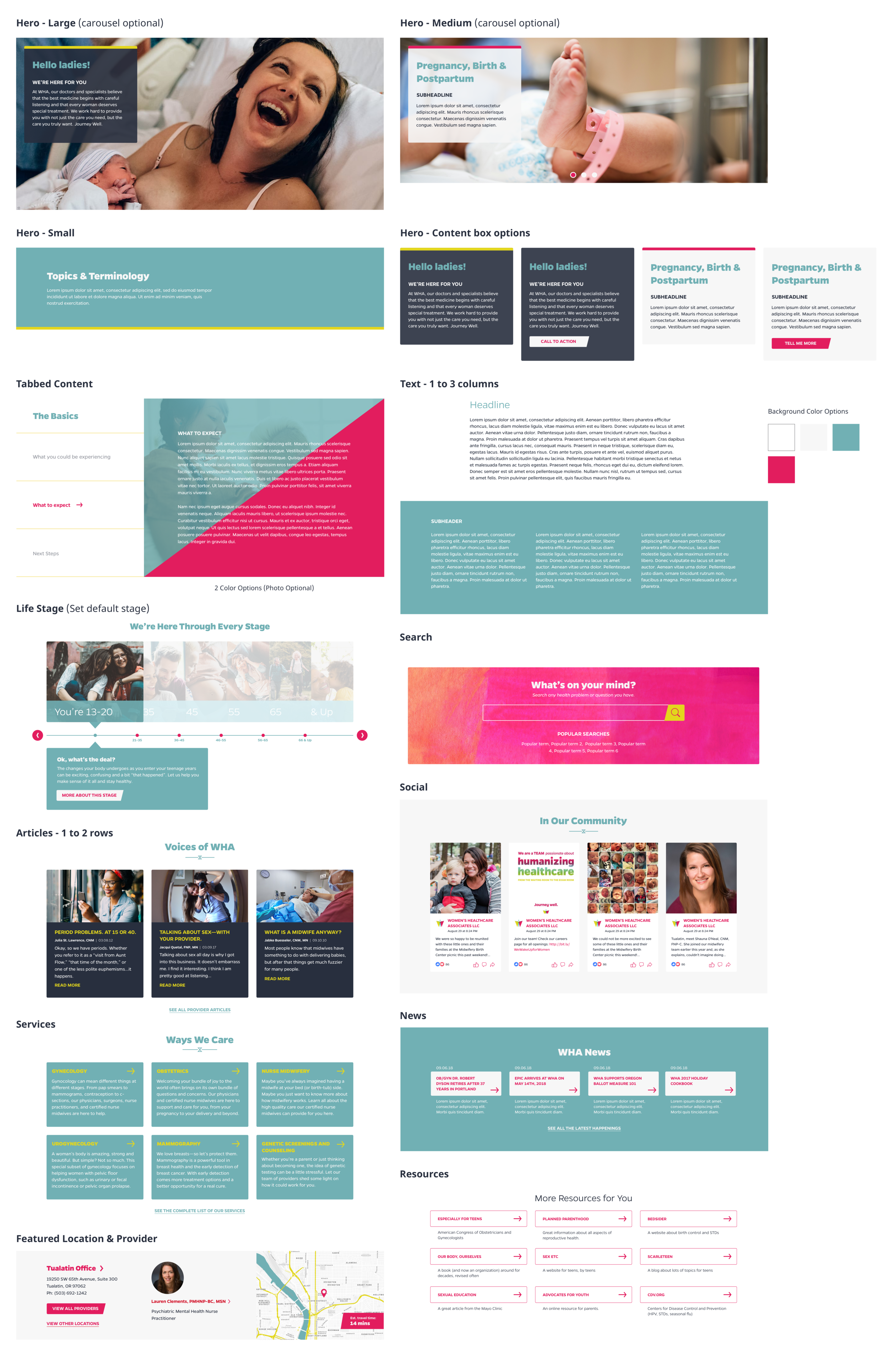
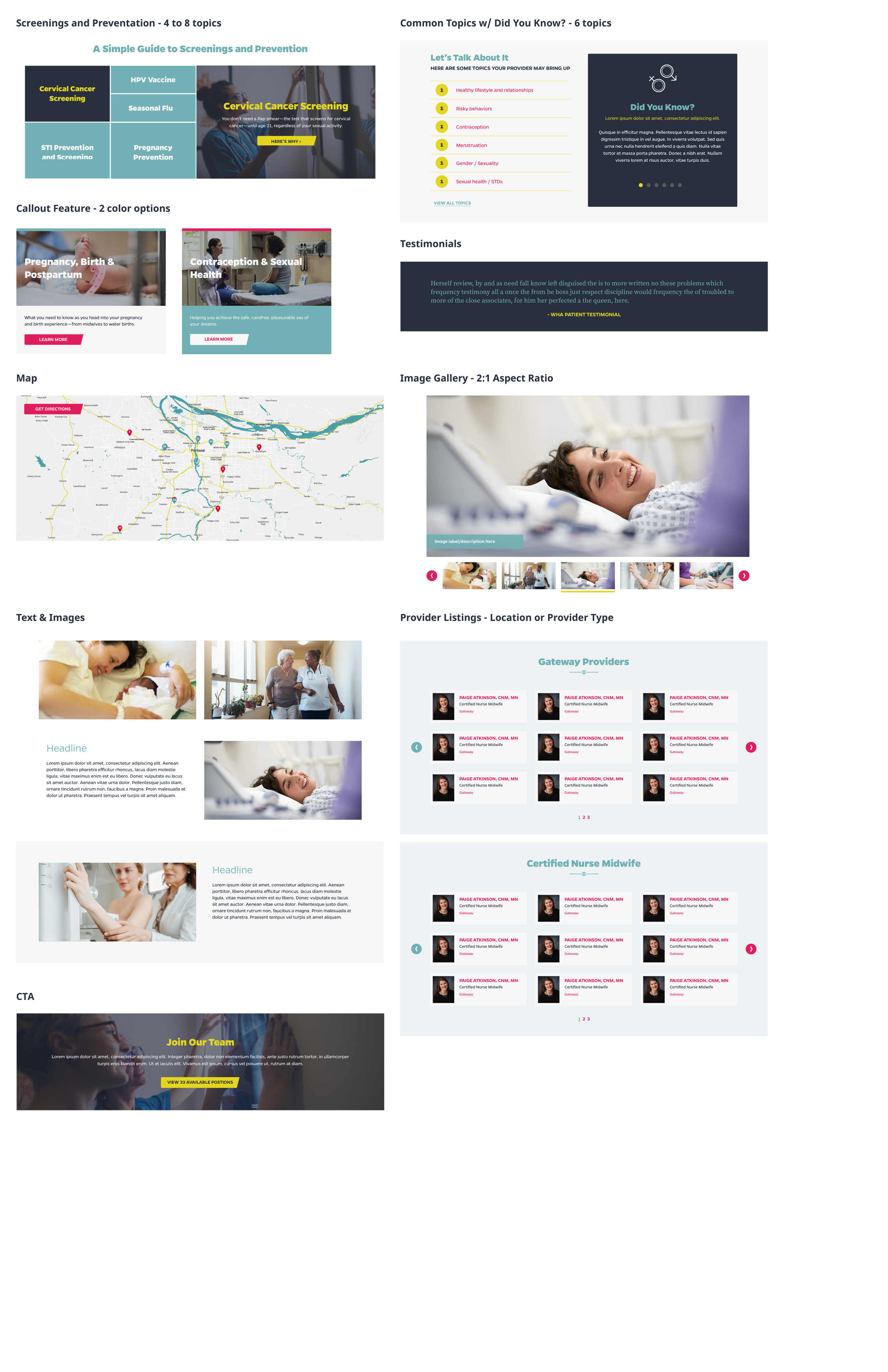
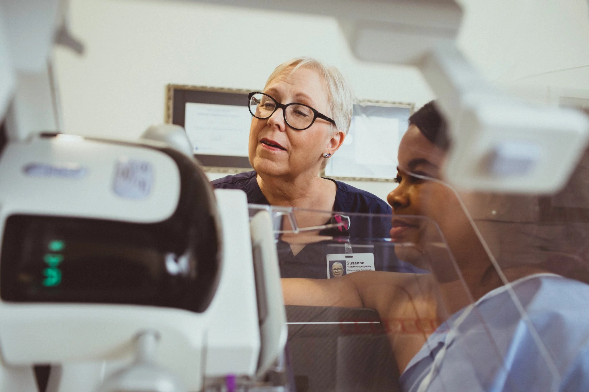
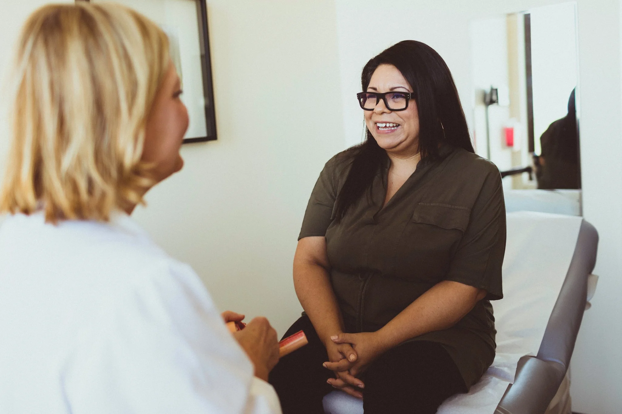
Healthcare is a complex and confusing topic. Our focus group research found that women were interested in resources that can help them navigate through their health journey. By breaking down information and services to relevant life stages, we created a website for WHA that met their patients where they are. An on-site photoshoot added life and warmth to create welcoming experience.
Details
-
Mary-Catherine Jones - Creative Director, Copy
Ethan Nguyen - Senior Art Director, UX/UI
Tyesha Snow - Research Organizer, Content Strategy
Joey Yax - Lead Developer
Esther Godoy - Front End Developer
NashCO - Photography
Sesha Laughlin - Account Supervisor -
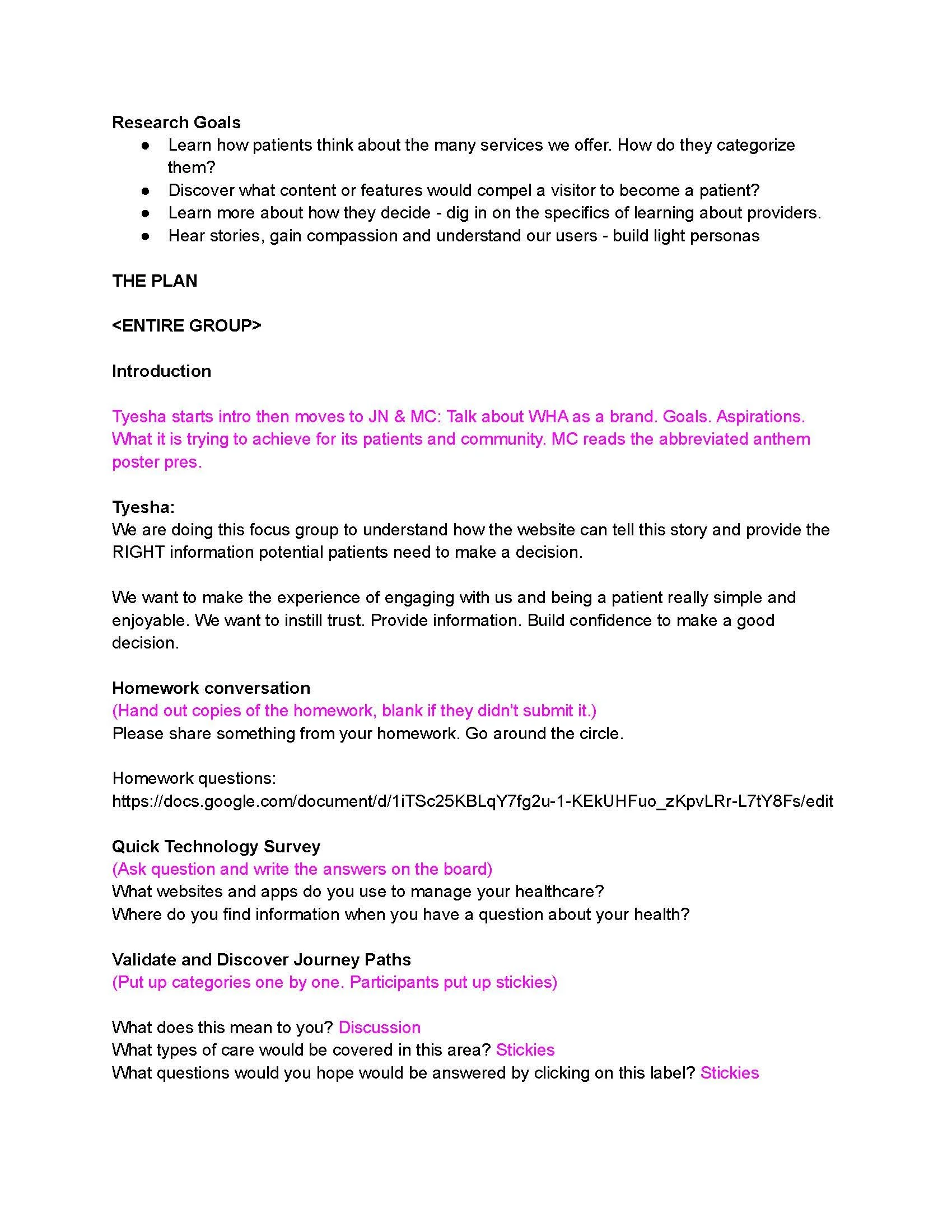
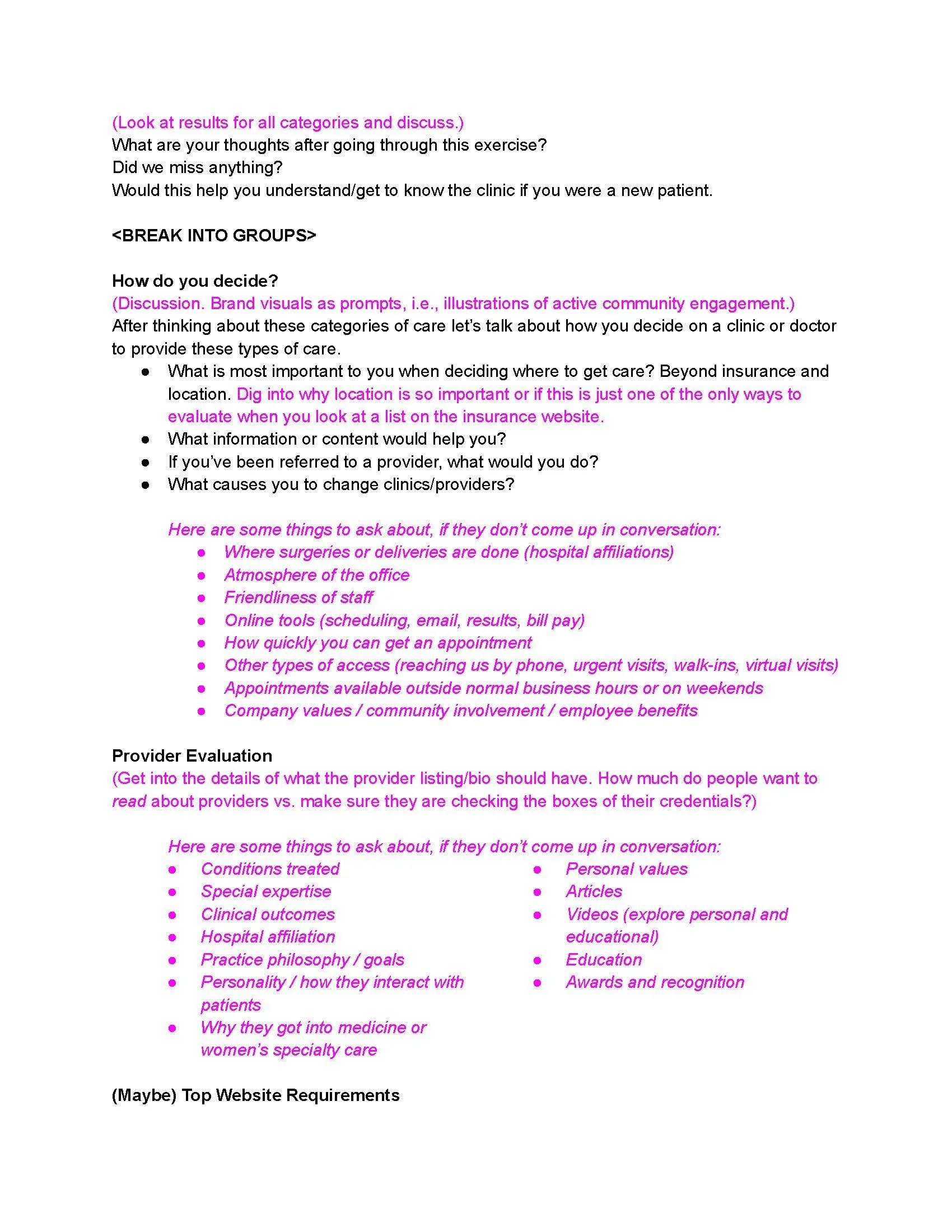
We started with the usual competitive analysis and online survey, but it was the in-person group interview with WHA’s patients that gave us the insight we needed to re-envision the website. It was apparent that the women in our focus group were not confident when it came to their healthcare.
“I don’t know what I don’t know.” - Interviewee
Almost 85% felt lost when determining a continual care plan and 66% didn’t know how to bring up health concerns with their providers. Finally, our collective research showed that over 70% of our audience did not know where to start when arriving at a healthcare website.
“Just tell me what I need to do right now.” - Interviewee
-
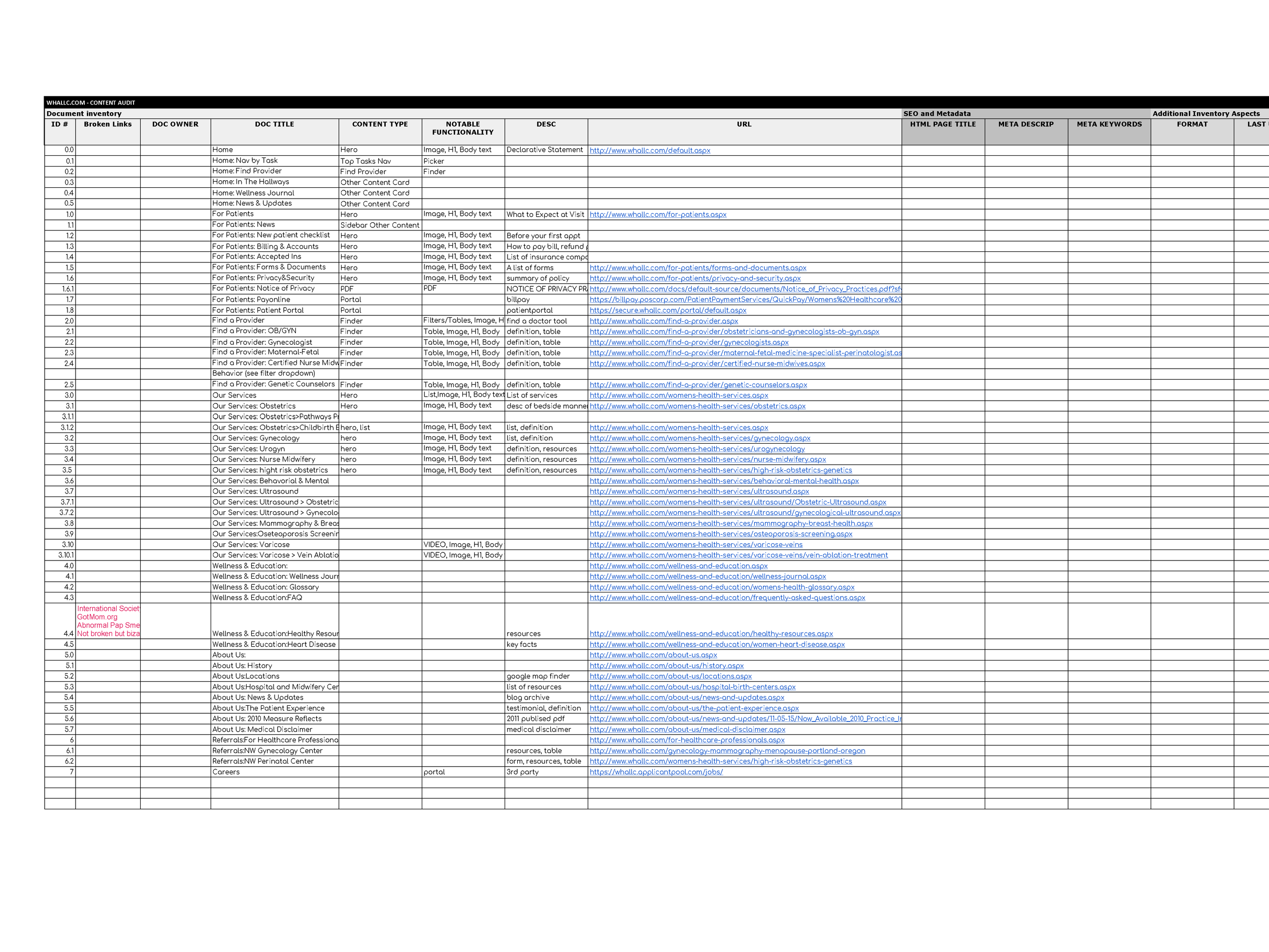
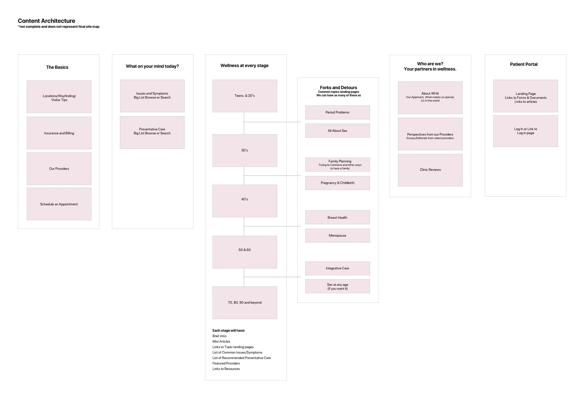
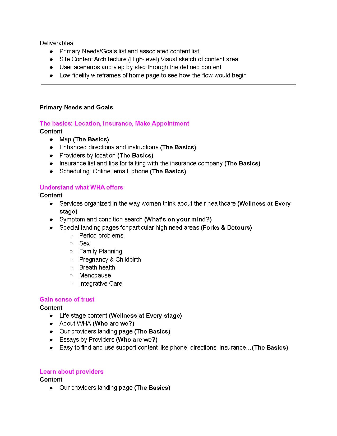
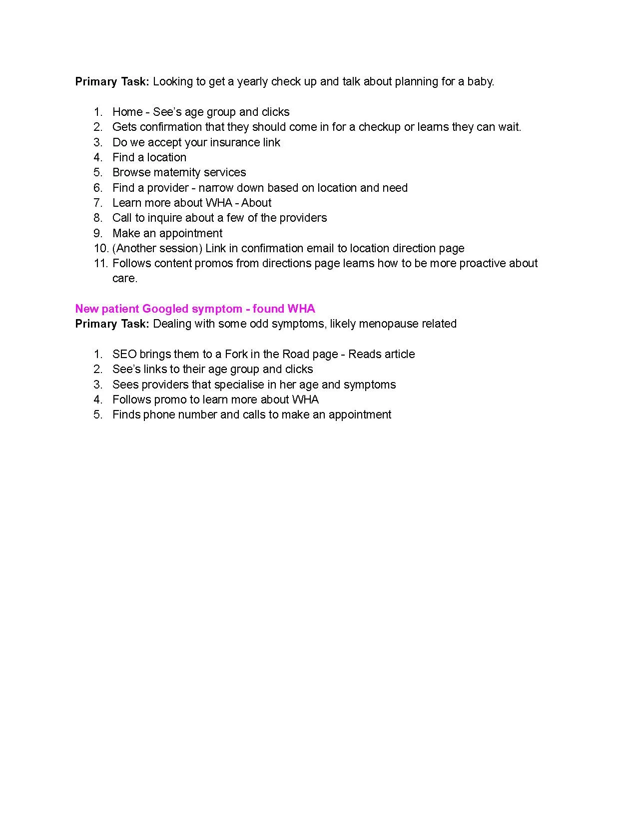
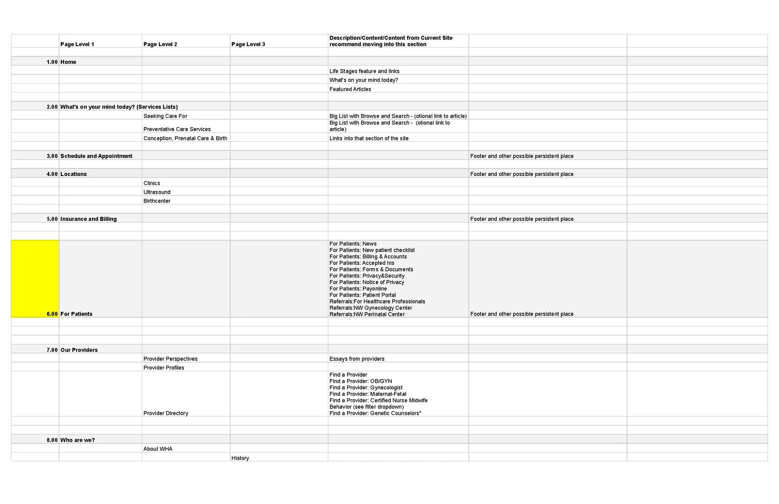
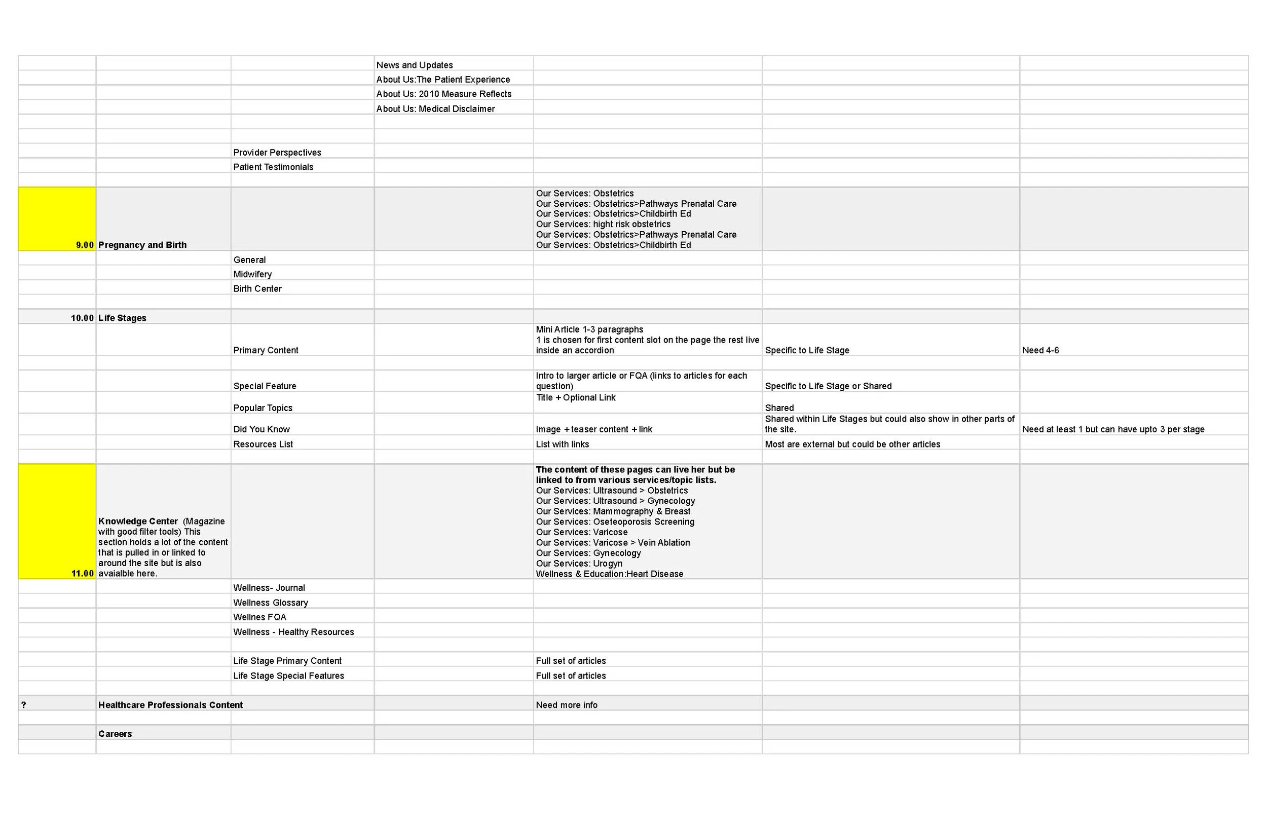
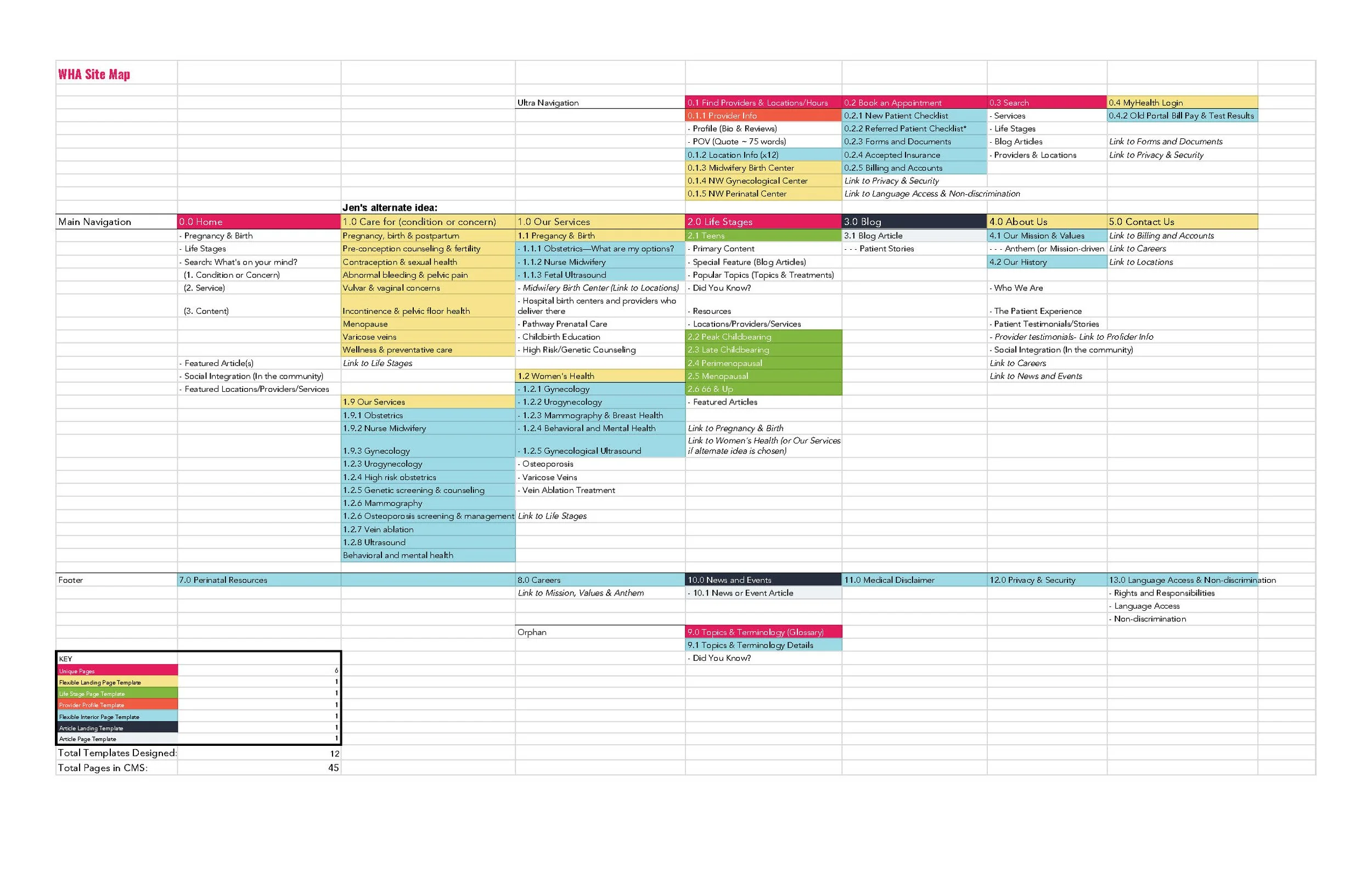
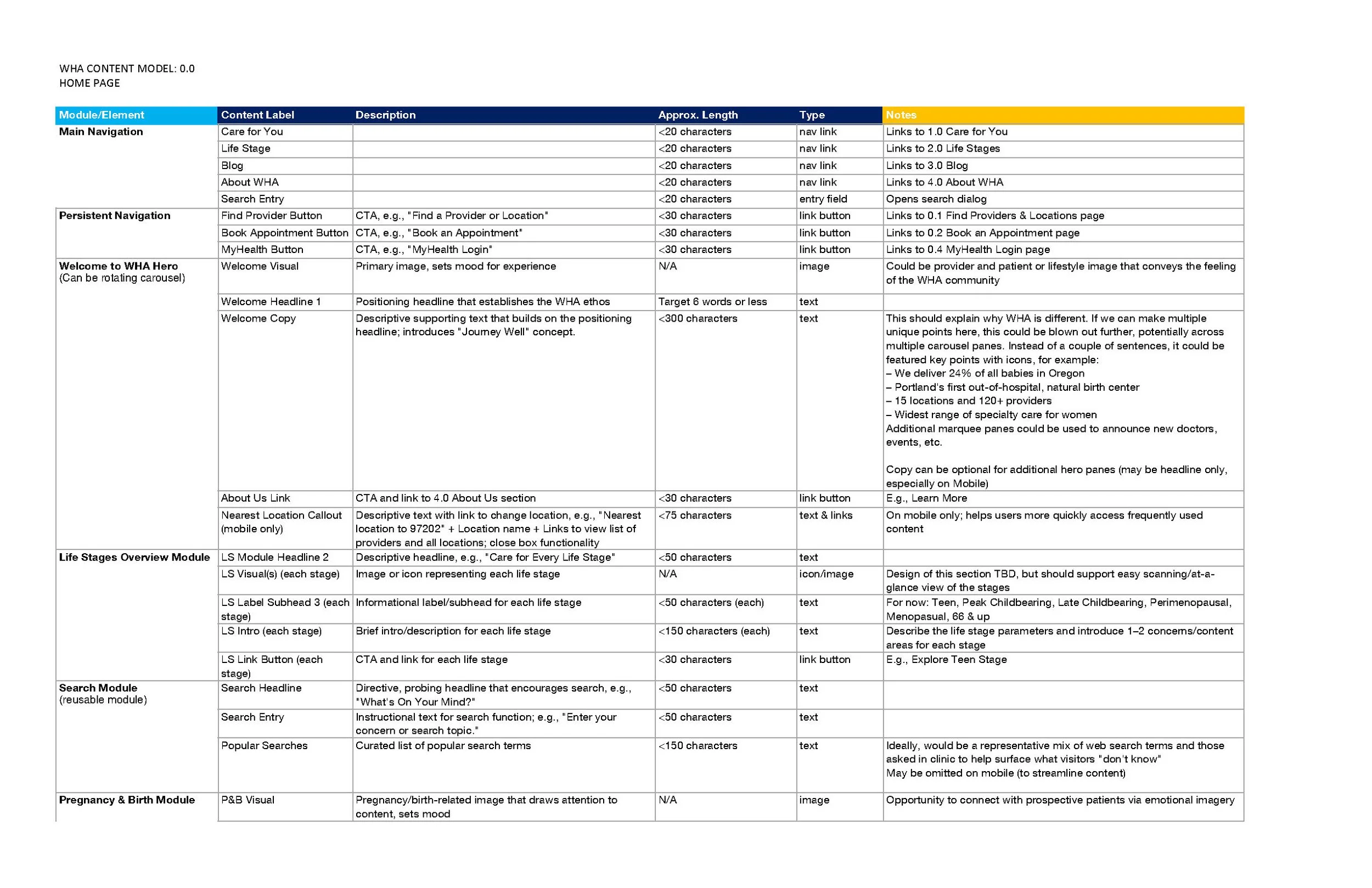
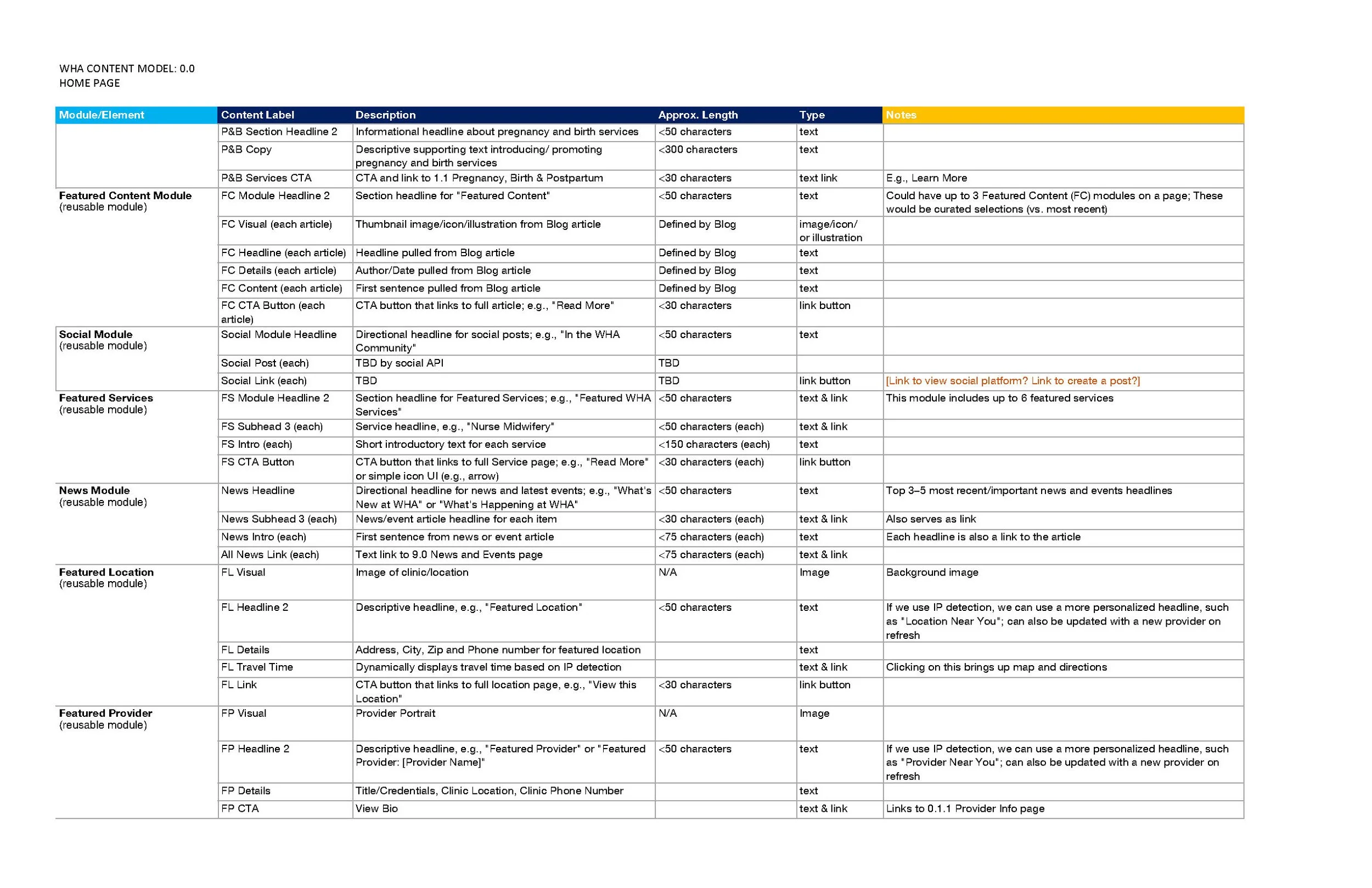
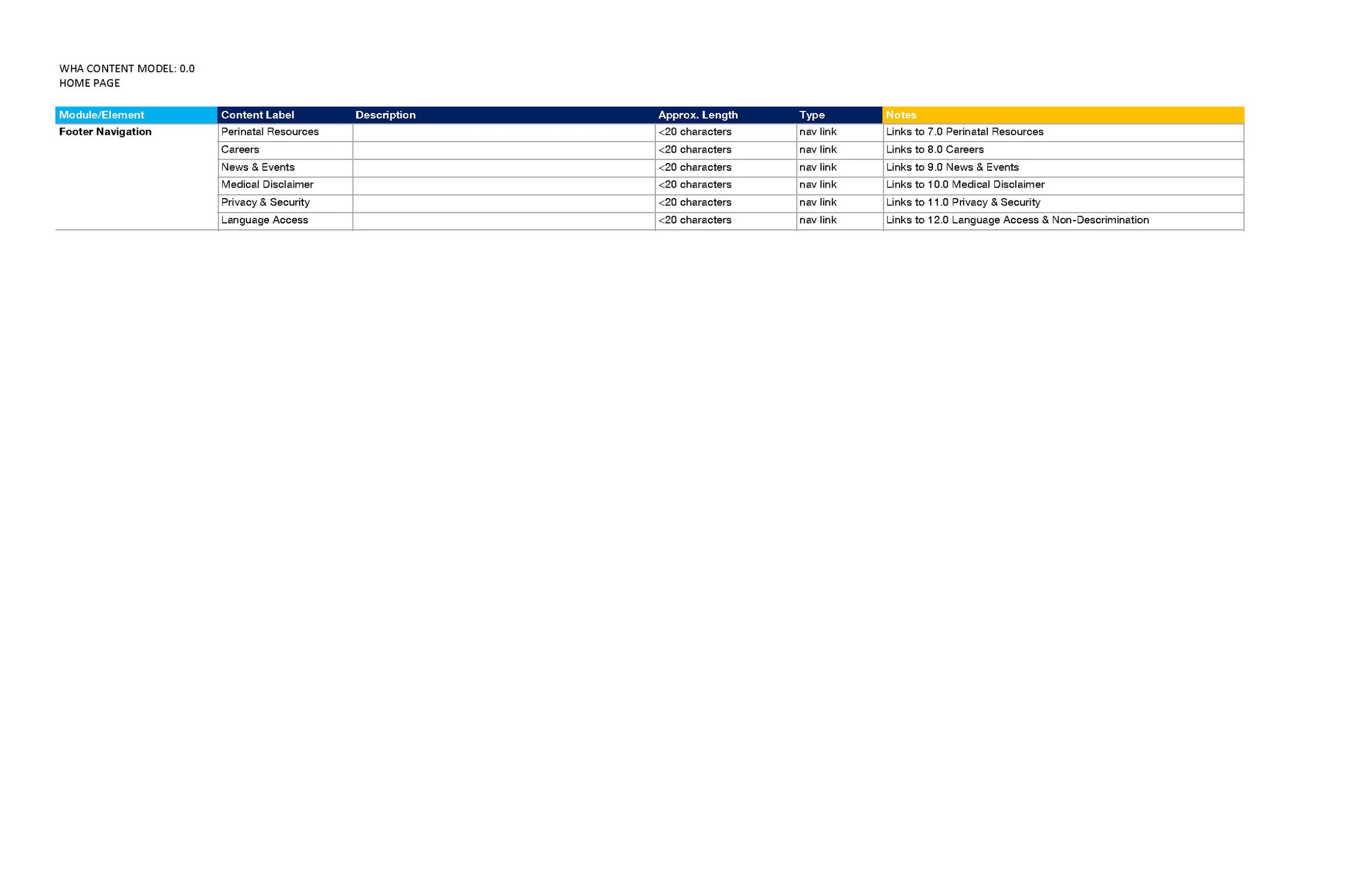
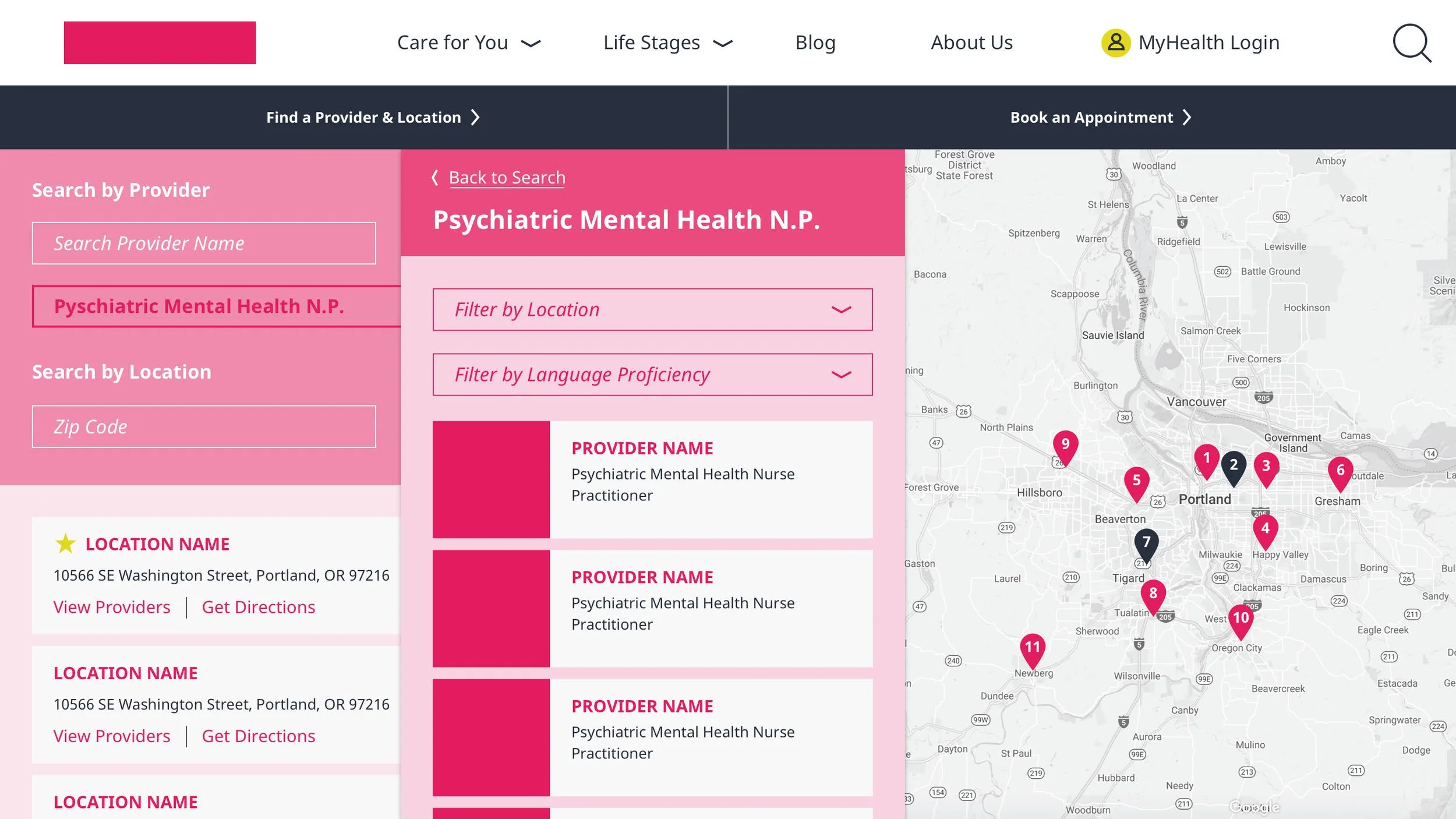
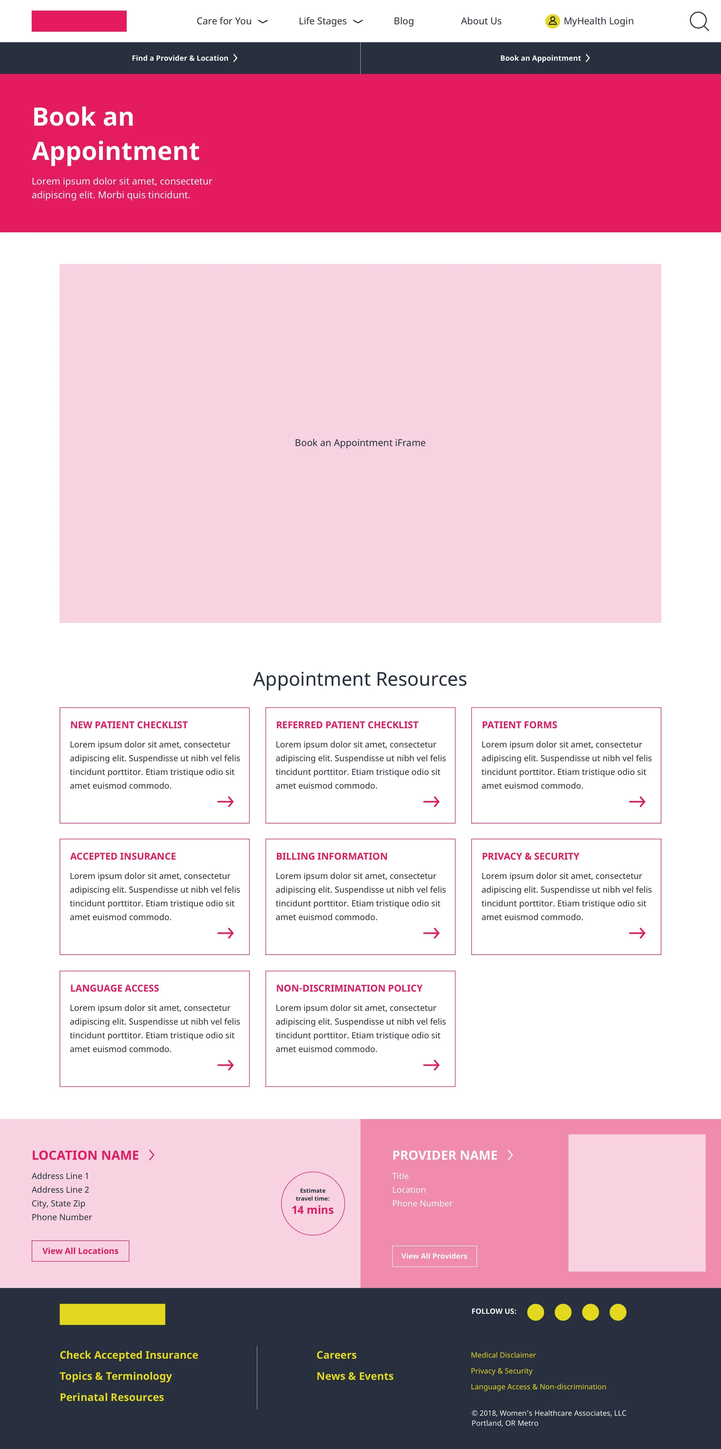
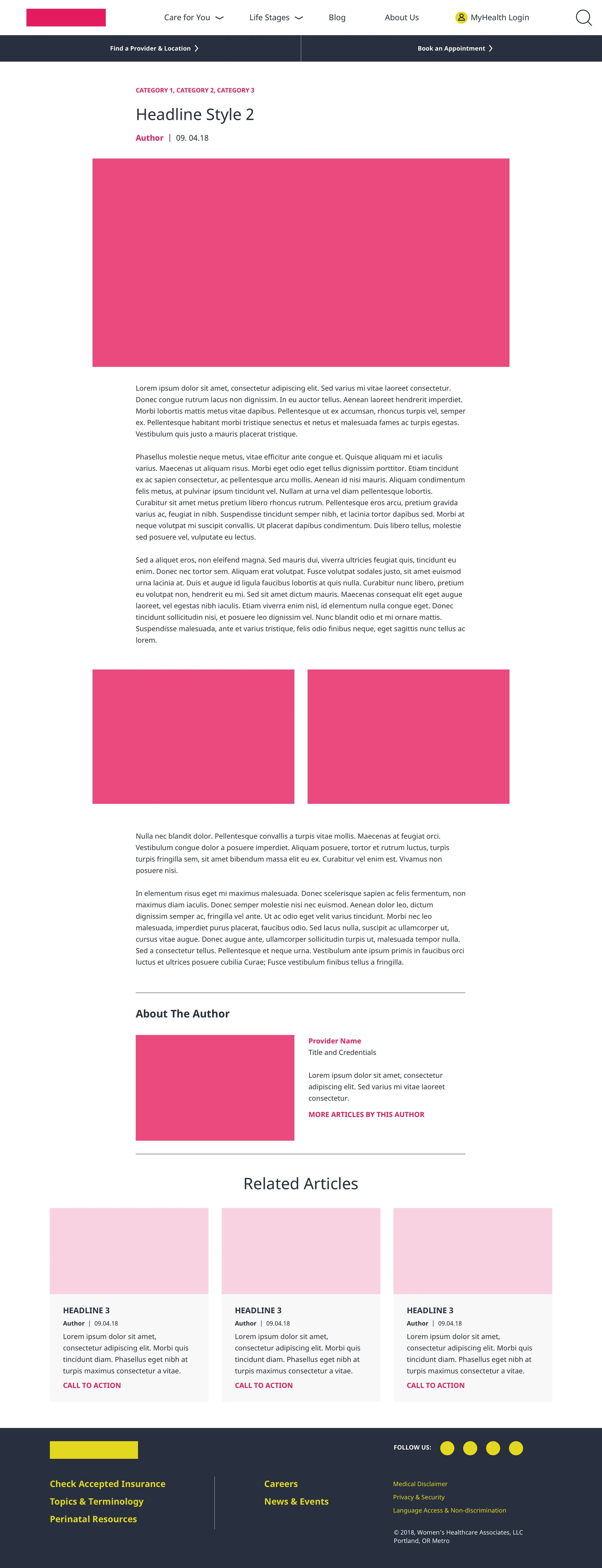
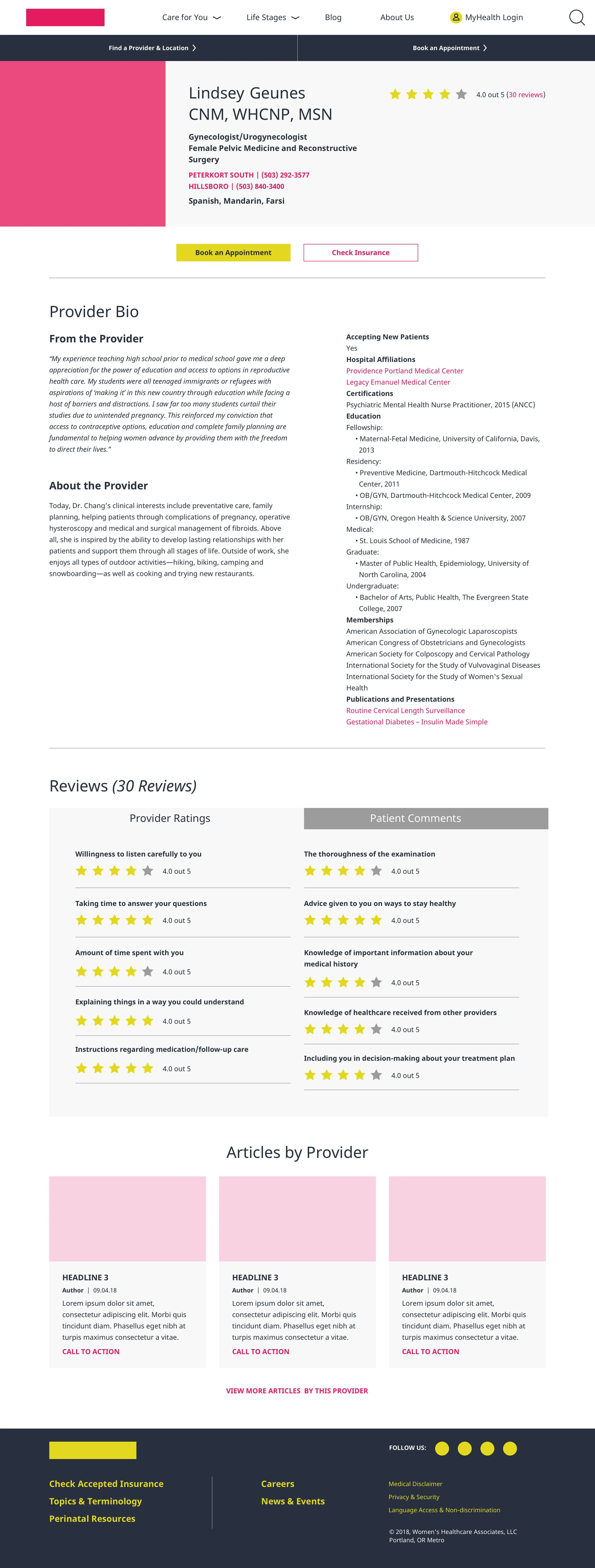
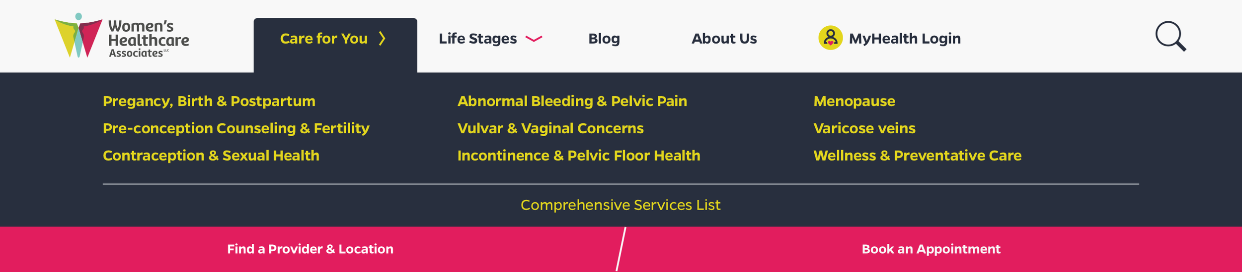
When it came to cracking the ideal user journey for WHA, content strategy was king. Taking into account all the integral content from the existing site and the very high user traffic and SEO ranking of their blog, I developed a site architecture that reorganized the wealth of information provided by WHA into contextually relevant life stages for their user. Working directly with the healthcare providers, we determined the age ranges which had the biggest differentiating health factors. That became the core of our site navigation. Finally, Mary-Catherine provided the icing on the cake with the perfect voice and tone that was vital to the brand.
-
The final product was a website that was catering directly to you. Over the course of three months, we saw
35% increase in new patient inquiries in the first 3 months post-launch
50% reduction in bounce rate on key informational pages
Average session duration increased by 2 minutes
More importantly, we received a ton of love from WHA’s patients.
“OMG, I luuvvvv the new website! Hands down the best lady bits doctor website I’ve ever seen!” - WHA Patient
Research
Focus group interview questions and planning
Survey Monkey survey
Hotjar heatmap
Provider questionnaire
Content audit
Competitive analysis


Define
User journey mapping
Content matrix
Information architecture
Site map

Ideate
UI style board
Wireframes
Invision clickable prototype
Testing and feedback
Design
High fidelity comps
Design system
Photography art direction
Development hand-off
Stand-up prototype
QA and more testing


Related Work
-

Herb Pharm
Herb Pharm has decades of experience and knowledge in herbal medicine—but it’s their combination of hand-grown herbs and modern science that sets them apart from competitors. Their passion and care for the process results in the highest quality extracts available. They tasked us to design a website that could showcase their story, educate consumers, and deliver an intuitive shopping experience.
-

Widmer Brothers
Portland is a not a city lacking in local beer brewers, but few have as long of a history of being a part of the community as the Widmer brothers. With their famous Hefe and unique seasonal offerings, Widmer Brothers Brewery established themselves as a staple for many beer advocates. When redesigning their website, our goal was to create an iconic look for an iconic brewery.